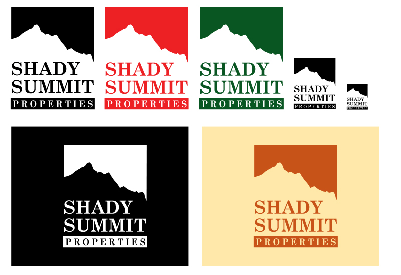
Shady Summit Logo
This is a simple logo/icon design for a real estate company. The client wanted a mountain as a prominent feature in the design and didn't want to commit to any particular color.
The reverse mountain icon was the result. This icon remains clear regardless of color and is easily recognized even when reproduced at small sizes.

